Managing the message with color and truncation
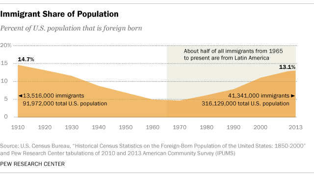
This is not a political commentary. I don't want to talk about immigration except to show how data visualizations about it-or any controversial topic-can shape public discourse.
This chart from Pew caught my eye because it's ordinary. A basic stacked area chart with about 12 data points. A few written statistics round out the understanding. It's so unremarkable in its construction and intent that we don't think about how it might shape our thinking.
So let's play with it to show how even prosaic charts represent multiple decisions that affect the meaning we get from them. To create variations on this theme, I estimated the values at each decade (I didn't have the raw data) and dumped those values into Plotly. From that I created several prototypes you'll see below. The first one took about five minutes to create; each variation after that took about a minute.[1]
First I recreated Pew's approach as closely as I could, including color and axis lines.
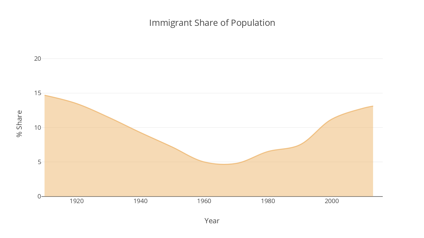
For this exercise, I'm going to ignore the shaded area that Pew uses to show when Latin American immigration began to dominate. I find it distracting in the original, and it will get in the way of our broader point here. I also left off the population values for reasons that will be obvious in a minute.
For now, we have a reasonable recreation of Pew's original chart and what do we see? We don't see 15%, or 13.7%. When we look at charts we don't see statistics, really. We see "more immigrants, then fewer, then more."
If we're not careful, because the immigrant area takes up most of the chart, and because the chart is bound by the 20% line at the top, we might think, "the population was mostly immigrants, then not, then mostly immigrants again." That may make you scoff, but it does happen. Our brains are trying to get to meaning as fast as possible. Without clear labeling and signals, our initial impression might be the wrong one. If it is, even for the briefest moment, then we need to correct it, which takes time and energy. Even if it doesn't last, it creates confusion in our brains.
And even if we don't make that mistake, our perception of how much of the population is immigrants, and how it has changed over a century, still might get skewed by this chart.
To test our perception of how many immigrants live in the country, let's look at the chart again. Pew lists for 1910 about 13 million immigrants to 91 million total people.[2]
What is that proportion like, 13 to 91? We know it's 14.7%. It's labeled. But how much is 14.7%? Abstract things like numbers don't perform well in helping us visualize proportions. Psychology gets in the way. Depending on the nature of the variable we may over- or underestimate what some value represents. For example, think about 2%. If I said you had a 2% chance of dying in a car accident this week, you'd straight freak out. That sounds really high. You see a lot of chance. But if I said you had a 2% chance of winning the lottery this week, you wouldn't get terribly excited. You see not much of a chance.
So let's visualize our proportion of immigrants. 14.7%. Think about that value. What does it mean to you? Is it a lot? A tiny amount? What does 14.7% look like? When you're ready, hover or tap on the image to see the what 13 million out of 91 million looks like when represented with all the data in our set.

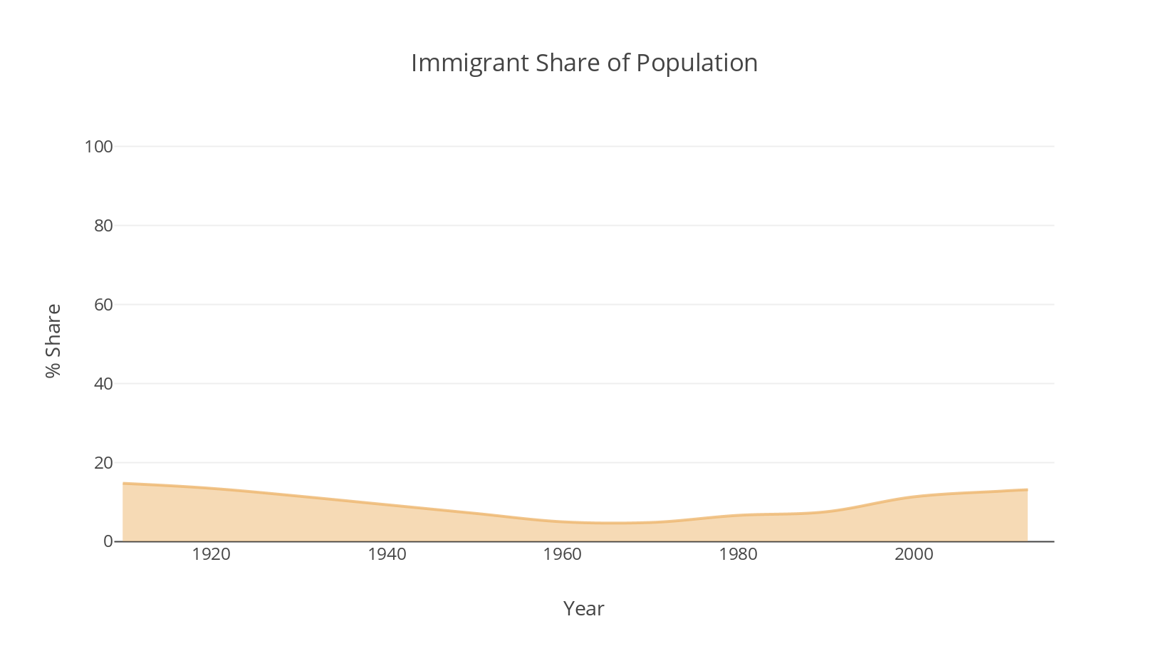
Is that what you expected? Does that look more like 14.7% than the original? Less? All we've done is remove the Y-axis truncation and run it to the full 100%. Why? Well, for one, it's a more accurate comparison. If we want to talk about the immigrant population proportionally, it can only exist with what makes up the rest of the whole: non-immigrants. By truncating the top 80% of the Y axis, we're making a decision to show some part of the non-immigrant population (the white space on the chart) but not all of it (everyone between 20 and 100 percent).
This becomes clear when we treat non-immigrant population as a variable rather than merely as negative space. Here, non-immigrants become part of the stacked area chart, represented by gray fill.
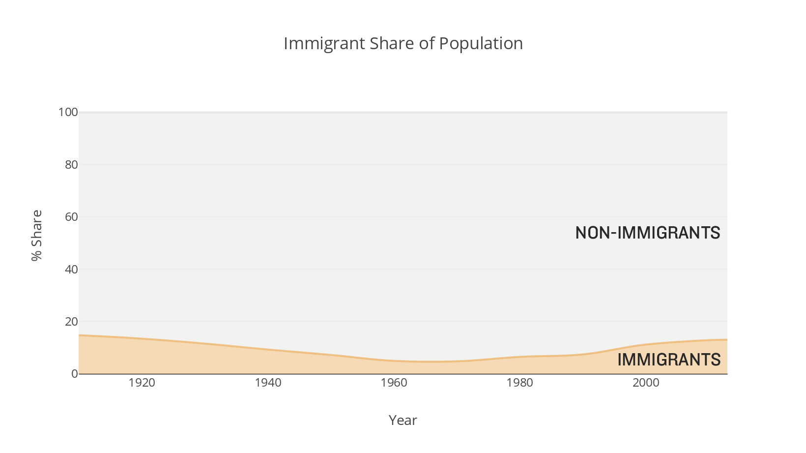
Imagine assinging the non-immigrant population as a variable, but then eliminating all the data above 20%. That wouldn't make sense. But that's what we do when truncate the Y axis in a scenario like this.
Truncating just above the top Y values is common. Most software programs do it automatically, and for good reason. When you're dealing with absolute numbers instead of percentages, say, dollars, the Y axis theoretically could go on forever. No computer can intuit where you want it to stop, so it just says I'll stop it a little above where there are no more values to plot. If it didn't do this, decisions about where to stop the Y become confusing and arbitrary.
But proportions create a dilemma. Truncating overstates the share out of 100 by focusing more closely (literally) on the main variable. That variable takes up a greater percentage of the total visual space than their values represent. In our original chart, 15% fills 75% of the chart! It also makes change more dramatic: fewer values on the Y axis means more distance between each value, meaning steeper slopes.
On the other hand, not truncating takes emphasis away from what we're meant to focus on: immigration, by giving more space to the rest of the data: non-immigrants.
We can go further. You may have noticed how quietly I introduced the non-immigrant data. I used a barely-there gray to fill the space. The eyes still go to the filled color. Using light gray, I'm sending the signal that that data is secondary, background information for context. The colorful thing is more important. We could send a different signal.
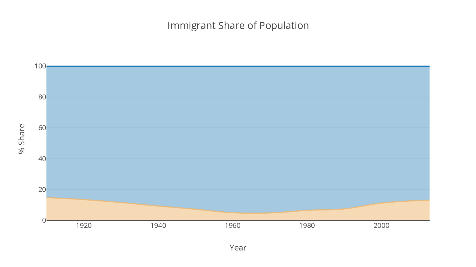
Now, I'm telling you both the immigrant and non-immigrant populations are important, and probably about equally important. I gave them both colors that draw our eyes. The colors have equal opacity. And the fact they contrast means they are in opposition to each other. I'm saying Compare these populations rather than Look at the immigrant proportion of the population.
Let's keep going.
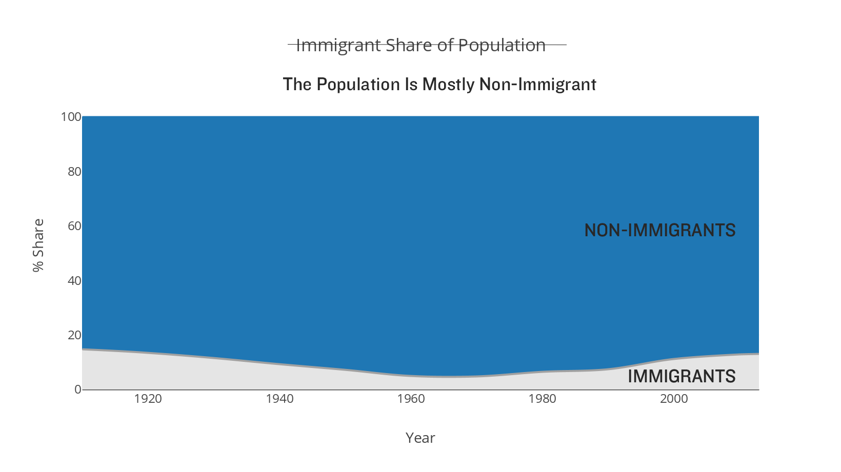
Now I'm sending your eyes to the vast field of non-immigrants. I threw in a new hed to emphasize a new take on the data as well to reinforce my decision. The light gray immigrant share suggests it's not our main focus. I'd even argue that the label for the immigrant population, stuffed into that corner, heightens the sense of smallness of that variable. The label barely fits!
To complete the transformation, I can flip our variables, since we often put the biggest shares on the bottom with stacked areas.
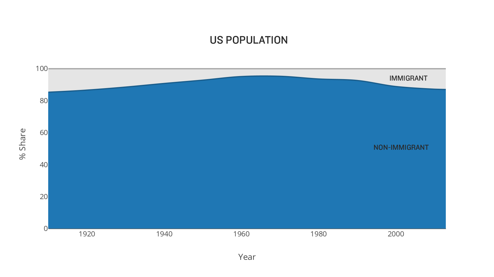
We've come a long way from the original chart.

In creating these charts, I never once touched the data. All that changed were decisions about truncation, color and emphasis. Each chart here represents the same statistics. But we don't react to each chart the same way. They don't give us the same feelings. They make us think different thoughts about the immigration population.
That's the crucial thing. More and more, public debate centers on data and statistics. How we represent that data matters. The choices we make-the choices that our software makes for us-matter. To make good decisions we need good charts.
The inevitable question is: Which immigration chart is right? You want to ask, Which chart should I use? The answer, as always, is It depends. What is your context? In general, with proportions, I would tend to show the whole range of values, because it's such a clearly defined, non-arbitrary boundary. And it's a manageable range of values.
But maybe not always. I can imagine scenarios in which changes from 1% to 1.3% are incredibly meaningful. Putting that kind of change on a full 100% Y axis makes the change invisible. You'll see a flat line. If that change is truly meaningful, a full axis may unfairly minimize the change.
As consumers of charts, we should be aware of how decisions about structure, color, and even labels affect the story a dataviz tells. The same data can be used to communicate wildly different ideas. Dataviz literacy is as important to the public discourse as understanding the issues. In fact, it's how we'll understand the issues in the first place, and then make informed decisions.
I mention this only to show that prototyping can be done rapidly, with a low investment and high returns, as you can access multiple views in short order. Prototypes will help you test hypotheses and find your visual approach. The more you can do these kinds of exercises, the better your visuals will get. ↩︎
Fascinating and surprising that Pew did not list immigrants to non-immigrants, for a clear, direct comparison. Instead, we get immigrants to total population, which means we've effectively counted immigrants twice, first as their own population of 13 million, and then as part of the 91 million total. The key proportion-immigrants to non-immigrants-wasn't fully visualized! ↩︎