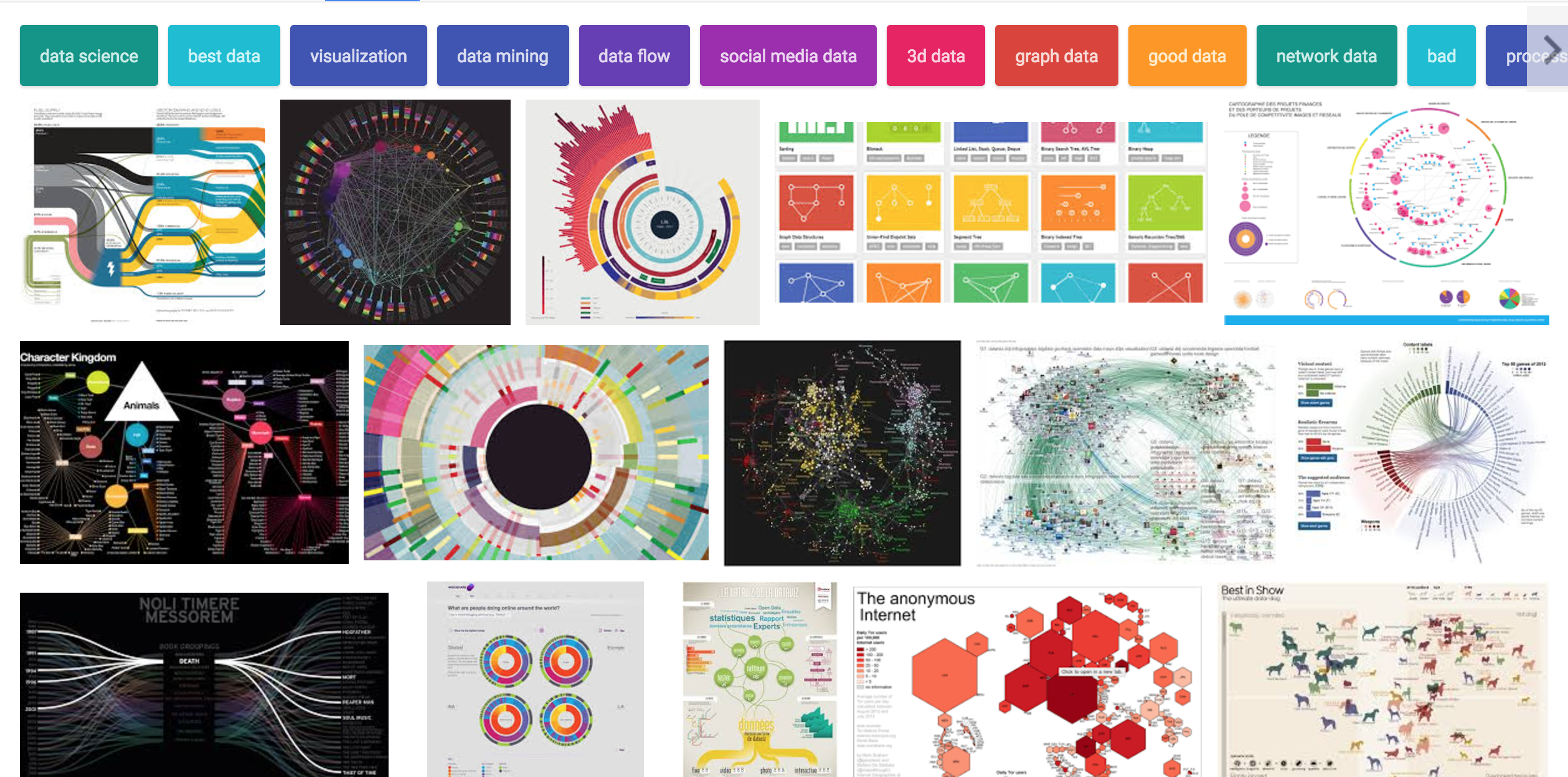
 Online searches on 'dataviz' produce results like this that make it plain that visualization is in its noisy, awkward adolescence, but it's growing up fast.
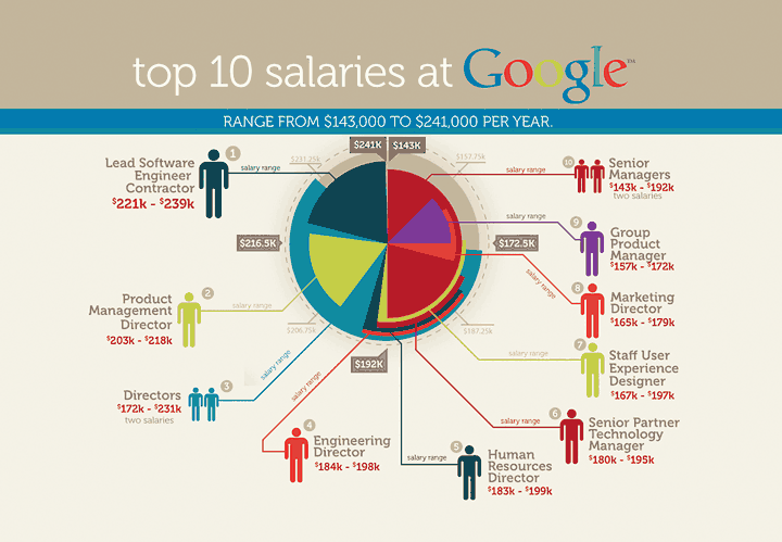
Many technologies and forms of communication experience a painful, necessary moment. Synthesizers endured A Flock of Seagulls. The internet had its GeoCities moment. And now data visualization has given us charts like the first one below, which comes from a site called JobVine.
 Source: jobvine.co.za
It’s colorful, and it sure looks like an infographic, but it’s nearly incomprehensible. This is what can happen when the tools that allow people to create new content—music, websites, data visualization—become available to the masses. Synthesizers have been around since the early 1900s, but synthpop didn’t take off until they were cheap and easy to use. The internet was the province of UNIX nerds for 30 years, until the first browser and an accessible markup language came along. And dataviz, at least as old as maps, was a time-consuming niche discipline—until now.
It’s an exciting, noisy time for dataviz.[1] Today websites like IBM’s Many Eyes (now defunct) and software such as Tableau Public allow anyone to upload scads of data and get back bespoke visualizations. Libraries of relatively inexpensive JavaScript and HTML tools make it easy for even amateur coders to create sophisticated, sometimes interactive charts. But this democratization means that much of the current output is, frankly, awful. Thankfully, we’re on a somewhat predictable journey that usually ends well.
Here’s how it goes. First, enthusiasts everywhere start using the new technology, because they can. A flood of people with wildly varying skills foist their creativity on the world. (Early 1980s desktop publishing led to an explosion of newsletters that used 20 colors and 31 fonts.)
Next, everyone starts overdoing it—using the newfound tools regardless of usefulness or appropriateness, just because they’re trendy. (Live-tweeting weddings? Really?) One form of overdoing it is the “beautiful duh!” graphic. For example, the New York Times, a pioneer on this frontier, once produced a visualization of words tweeted during the Super Bowl by region. It turned out that in Pittsburgh the most common word was “Steelers,” in Arizona it was “Cardinals,” during commercials it was "commercial" and during halftime it was “Springsteen” (he was performing). The Times invested in flying into space to confirm the shape of the continents.
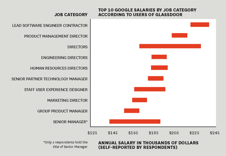
Eventually, however, people get better at using the technology, make important breakthroughs, and ultimately pull it to a better place. Yes, dataviz is having an awkward adolescence, but one can already see it starting to mature. Here, for example, is the same information about Google salaries, reimagined by a man named Kaiser Fung:
 Source: junkcharts.com
Fung runs JunkCharts, a site that’s part of the bustling online community of dataviz enthusiasts who produce some of the best examples and argue about their merits. This chart is more accurately labeled and easier to understand than the one from JobVine, and it includes no extraneous iconography or color. No doubt Fung is a disciple of Edward Tufte, whose canonical books—The Visual Display of Quantitative Information, Visual Explanations, and Envisioning Information—and one-day courses preach restraint, simplicity, impartiality, and accuracy.
Still, Tufte’s principles probably aren’t enough anymore. The first edition of Visual Display was published in 1983, at the dawn of the PC age, when simple digital graphics tools, spreadsheets, and even color printing were nascent. It couldn’t foresee the explosion of social sharing of data visualizations or, more crucially, how many infographics would be competing for our attention. So although Tufte’s students will list the ways the second chart is better, casual observers will counter that it’s also boring as hell. Which one do you think they’d share on Twitter and Facebook?
Today’s best visualizers are therefore moving beyond Tufte to reconcile the tension between information and design, accuracy and excitement, telling and selling. You can find their signal amid the noise.
Take Catherine Mulbrandon, an economist and interactive designer, whose website, Visualizing Economics, and recent self-published book, An Illustrated Guide to Income in the United States, present hundreds of careful infographics whose simplicity belies the millions of data points they represent. A favorite example is a tree map that shows a decade of change in every job category the U.S. Bureau of Labor Statistics tracks. Gains are shown in blue, with larger gains a darker hue. Losses are presented likewise, but in pink. The pinkest sectors are manufacturing and, astonishingly, information. The immediacy with which this hits the viewer is profound, and that’s the magic of all great visuals—what another talented practitioner, Kirk Goldsberry, has called the “bliss point.” They provide an instant shot of pleasure—aha!—and then invite deeper investigation.
The work in David McCandless’s The Visual Miscellaneum and Information Is Beautiful, along with his website, does this too. A data journalist who contributes to global publications such as Wired and the Guardian, McCandless sometimes chooses playful topics—side-by-side visualizations of how to make popular cocktails and hangover remedies, for example. But he’s also deft with serious information. One remarkably clean graphic of his shows that 19 simple changes to one’s daily habits can save eight tons of carbon consumption a year. Another, on direct and indirect water use, reveals that when you take farming practices and other factors into account, the household task that uses the most water is not showering or doing laundry, but cooking an egg.
Mulbrandon and McCandless are joined by others: Martin Wattenberg, Fernanda Viégas, Jer Thorp, Nathan Yau, and Jeremy Howard, to name a few. But we’re going to need many more like them in the future, and more sophisticated authoring tools, too. We’re creating data at an unprecedented pace. Without a visual layer, making sense of it all will become increasingly difficult. Those who can visualize well will gain a competitive advantage. They’ll find insights that others won’t. It’s only a matter of time before sophisticated infographics become standard fare at board meetings. What management team wouldn’t love to have an interactive visual of every product its company sold, with details about who bought it, for how much, at what time of day, what the weather was like, and what else they bought at the same time? Charts and tables presenting all that information would be nearly impossible to analyze. With visualization, meaningful analysis of big data becomes possible.
Good dataviz will also help us with complex ideas. The archetype to date is the viral video “Wealth Inequality in America,” which dramatically visualizes the income gap. Other examples include visualizations of drone strikes carried out by the United States and the resulting death toll, each Fortune 500 company’s effective tax rate, and the distance to Mars.
David McCandless’s new book is called Knowledge Is Beautiful I think the progression of his titles (and content) just about sums up the coming maturation of the discipline, from miscellany to information to knowledge.
That’s where data visualization is going. It has to. In the future it may be the only way to make sense of the nearly infinite amounts of data we’re creating. We’ll get there. And when we do, we’ll look back on this moment as we look back on late-’90s websites and new-wave keytars.
This essay originally appeared in the October, 2013 edition of HBR. Obviously much has changed since then but it was a moment when I had started mulling the possibility of a dataviz book. Originally I thought I'd edit one. That obviously changed. I would add to this list today many other people and sites doing great visual work. Chief among them: Fallen.io, R2D3, and The Upshot. ↩︎