Dataviz is deeply enmeshed in sports; it always has been

Here in the United States, football is starting again. Younger readers may find this hard to believe, but once was a time you couldn’t live stream a football game on your phone in hi-def from inside a plane hurtling 600 MPH 35,000 feet over the Rockies. Srsly. You had to sit in front a TV plugged into the wall, and you had to watch the boring parts and commercials, too. Crazy, right?
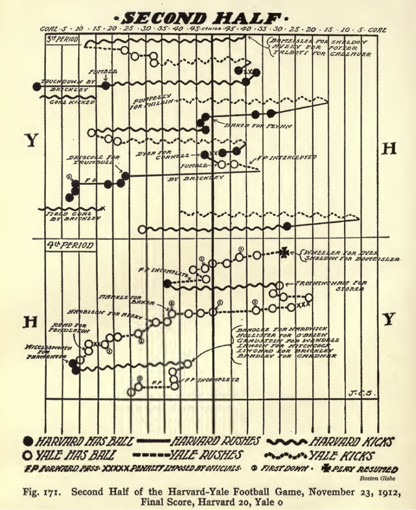
And before that, if you weren’t at the game, what could you do? That brings us to the beautiful relic above, a visualization of the second half of the 1912 Harvard-Yale football game, from the Boston Globe, as it appears in Willard Brinton’s incredible 1914 book, Graphic Methods for Presenting Facts.
As a historical artifact, this viz is fascinating and fun. Back then, the forward pass was so insignificant that it didn’t merit a visual distinction, just the meek notation “F.P.” (I count two completions, two incompletions, and one interception). Modern fans exhausted by the officious nature of today’s games will note also that only four penalties were called in the half.
One of cheapest tricks on social media is to post pictures of antediluvian technology or obsolete inventions solely for us to collectively mock them. Ha ha look at those simpletons with their giant calculators. They really were dumb, weren’t they? I don’t present this Harvard-Yale game chart to snicker at it, but to praise it. It’s an impressive feat. In 1912, for people who weren’t at Harvard-Yale — the Super Bowl of its day — there was no replay, no highlights, not even radio to help them get them closer to the game. The only way to experience the game action for most people was through the newspaper. That puts a lot of pressure on the game story and this visual to serve its audience well. And remember that “J.C.S." — whoever he or she was — was working on tight deadline and visualizing by hand. The chart had to be made fast, kept clean, and include the right—and the right amount of—information.
The Harvard-Yale game chart reminds us that making visual sense of games is hardly a recent innovation. Today, dataviz is deeply enmeshed in sports and layered into live sports and highlights in ways we take for granted. Think of the yellow first down lines in football, pitch trackers in baseball, even the world record pace lines used in swimming races at the recent Olympic games.
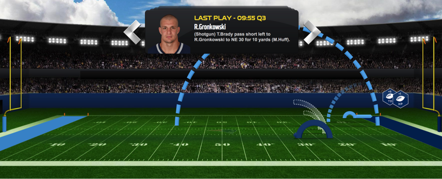
But even now, when I check in on my fantasy football team, and want to see what’s going on in a game I’m not watching, I notice a chart like this one from the NFL’s own site.

It’s not so different from the Globe’s Harvard-Yale visualization from 104 years ago. I might like the 1912 version better.